Aside
Money-saving App to simplify and motivate through visualisations.
UX Design
UI Design
Branding
Type
Concept Project
Category
Fin App
Timeframe
2 weeks
Tools
Figma
Challenge
From partial instructions to a distinguishable product
Problem
1
Overwhelm from complexity, the amount of information and the technical jargon used
2
Difficulty identifying spending patterns.
3
Lack of time for money management
4
Limited financial literacy and advice
User Research
Uncovering Financial Habits, Pain Points, and Unique Saving Strategies
The goal of the research is to understand the goals and pain points of users with varying levels of financial literacy as they manage their personal finances. I am looking to inquire what tools, digital or analog, if any, do they use to keep track of their finances.
I target a diverse group of participants with different financial knowledge levels, income brackets, and financial management habits. I specifically began by exploring users’ current financial behaviors, their motivations for saving, and the challenges they face. The 10 Interviews were schedule in 3 separate days, some performed online, and some in person.
Research Results
Patterns
Heavy reliance on manual methods (spreadsheets, note-taking).
Users often juggle multiple tools (banking apps, third-party apps) but lose track of the overall financial picture.
Most users focus on checking account balances rather than reviewing spending patterns or planning long-term.
Pain Points
Difficulty maintaining a consistent savings routine.
Struggles in identifying areas where expenses can be reduced.
Frustration with budgeting tools requiring too much manual input.
Confusion with financial jargon.
Surprising Findings
Some users use separate bank accounts to “hide” money from themselves as a saving strategy.
Recurring transfers to investment accounts are often used as a "forced" savings method.
A few users avoid digital payment options, relying on cash to limit impulse spending.
Goals Mentioned
Users want a clear, easy-to-understand overview of their spending.
Desire for automation in saving and budgeting.
Flexibility to adjust financial plans.
Interest in personalized, contextual financial advice.
User Needs and Requirements
Solution
A powerful yet simple platform that makes exploring history engaging and accessible.
Simplicity and clarity are prioritised throughout the product.
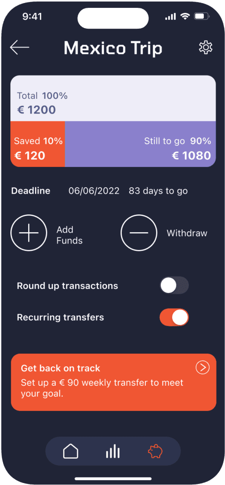
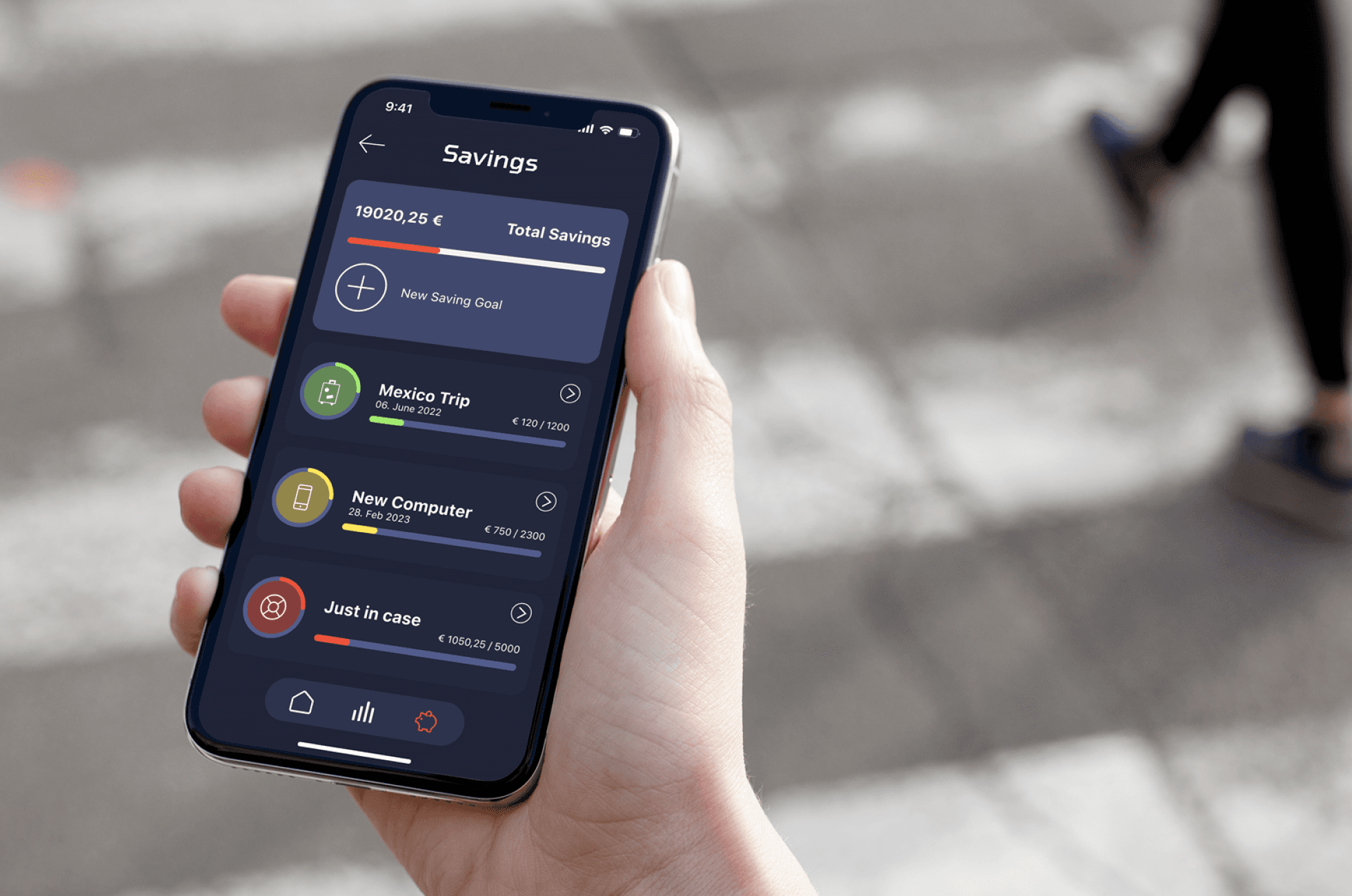
Savings Plans are the focus, helping users link numbers to real-life goals.
Navigation is kept minimal for ease of use.
Consistent color coding for Income, Expenses, and Savings ensures clarity.
Insights and tips are integrated where needed to improve saving habits.
1
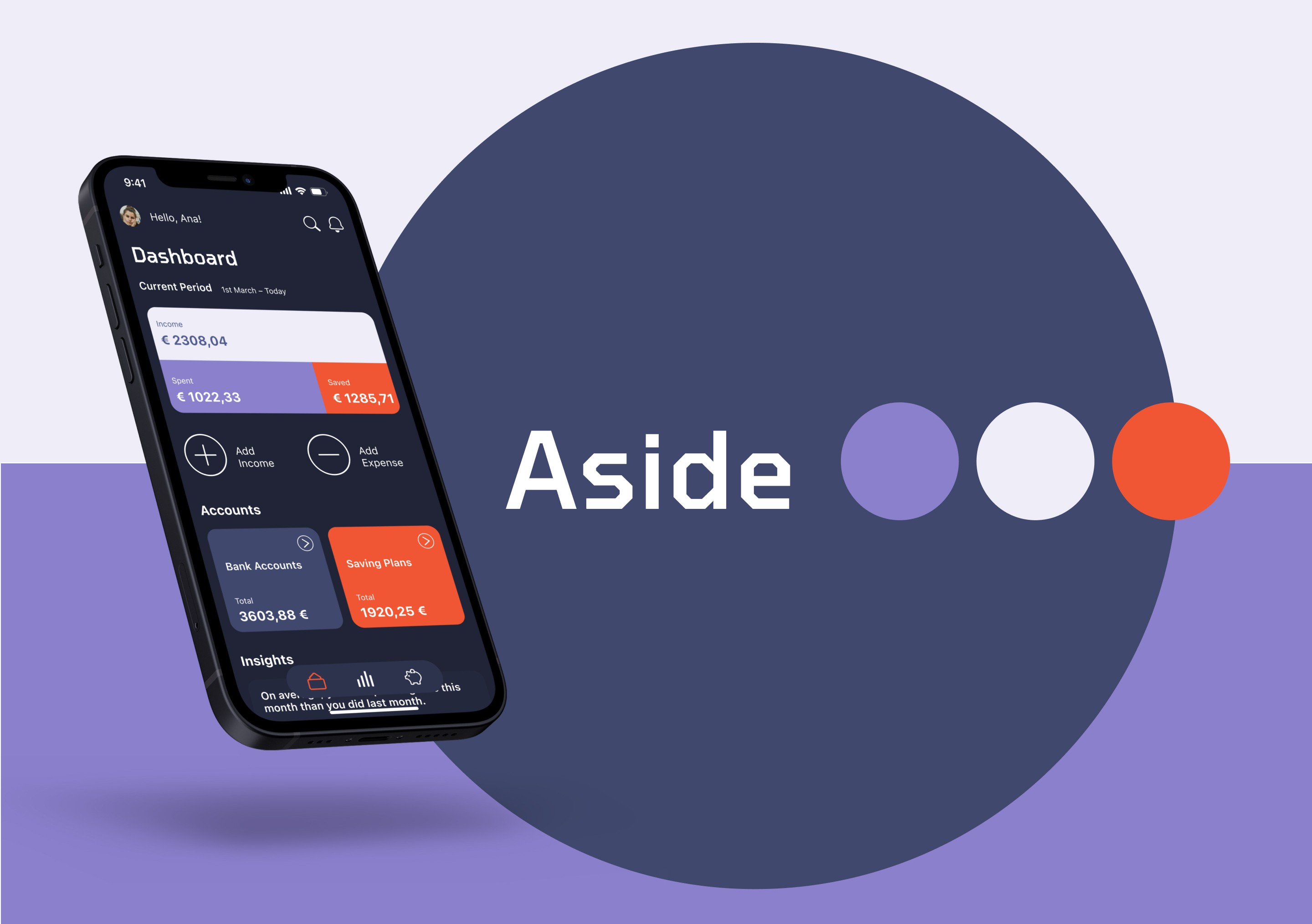
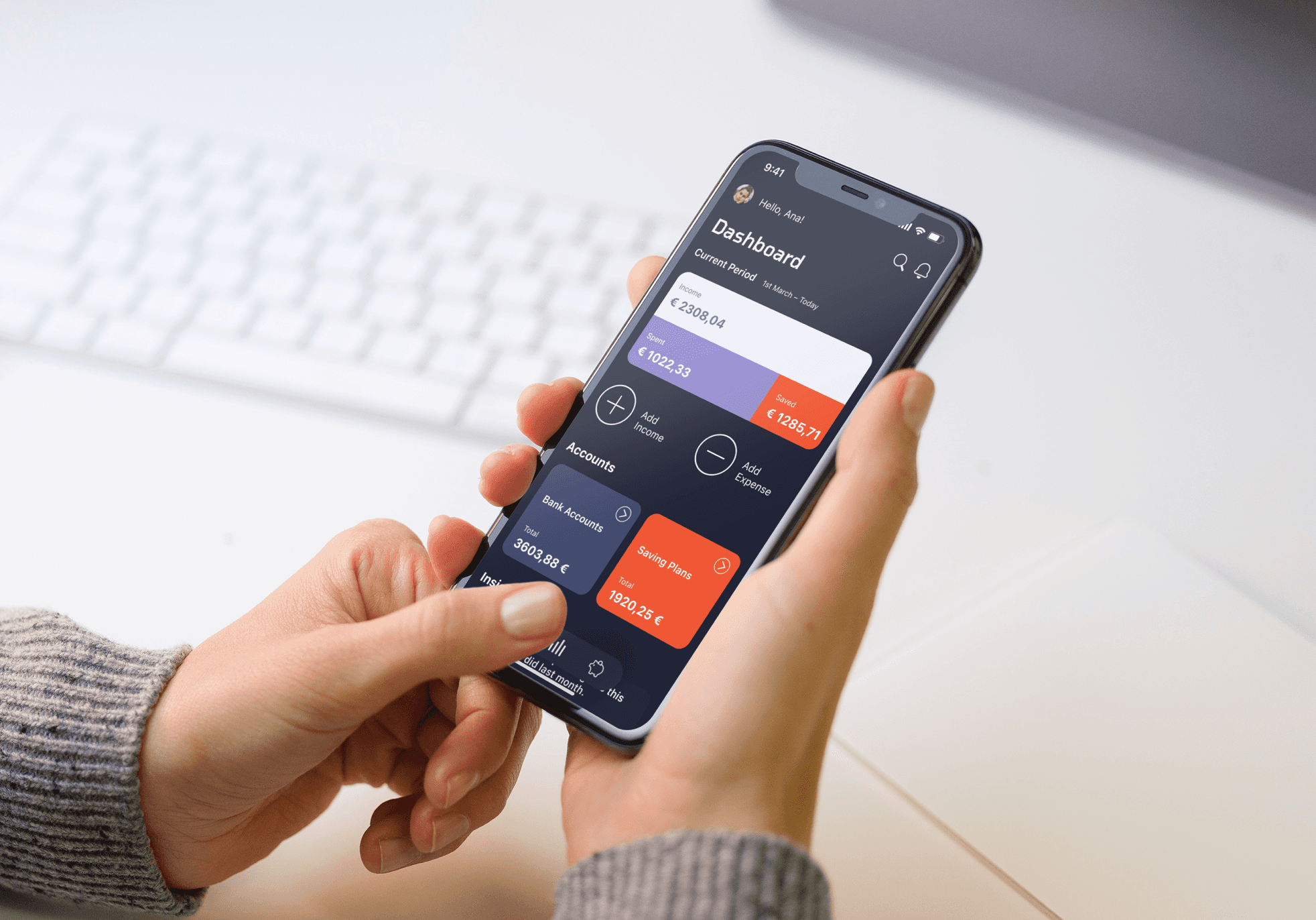
Dashboard
Main screen displaying key information at a glance.
2
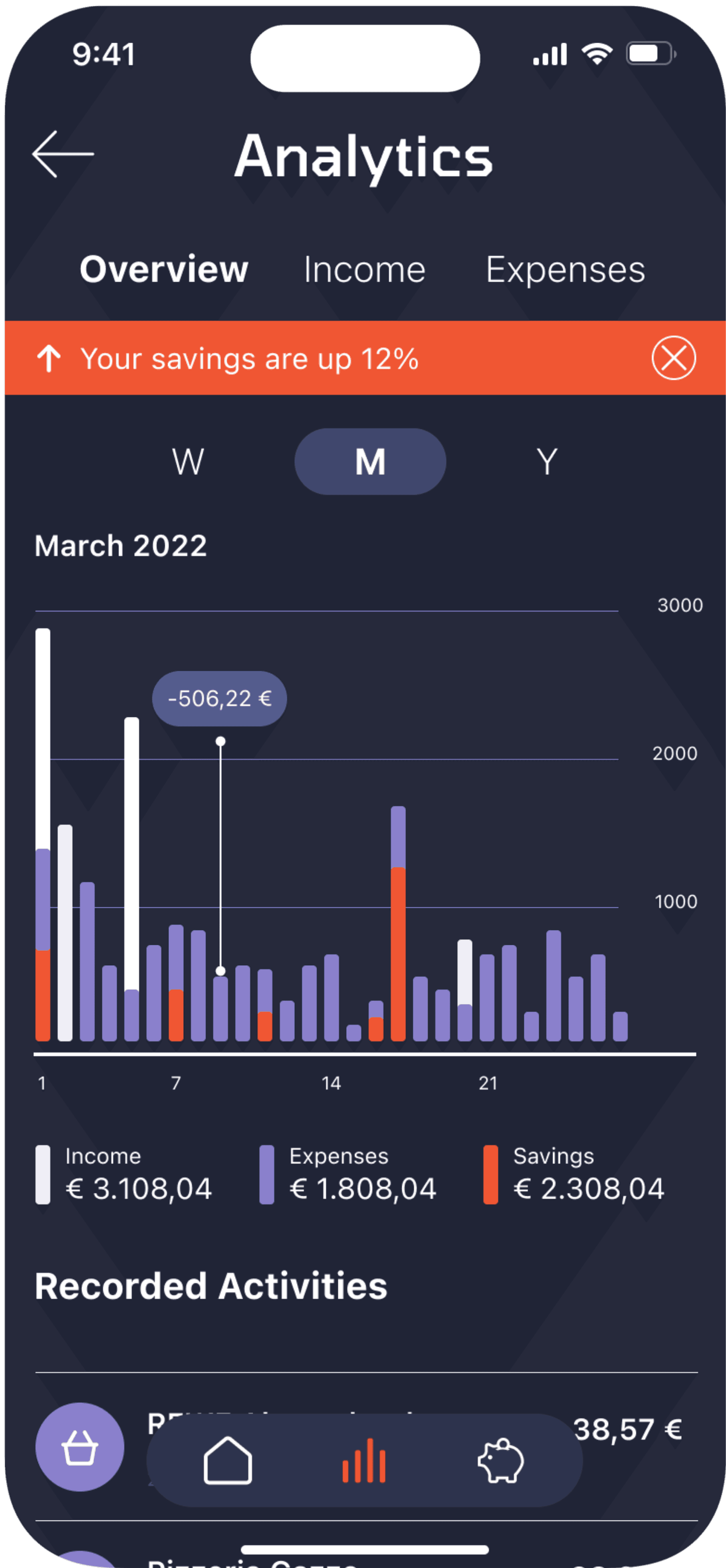
Analytics
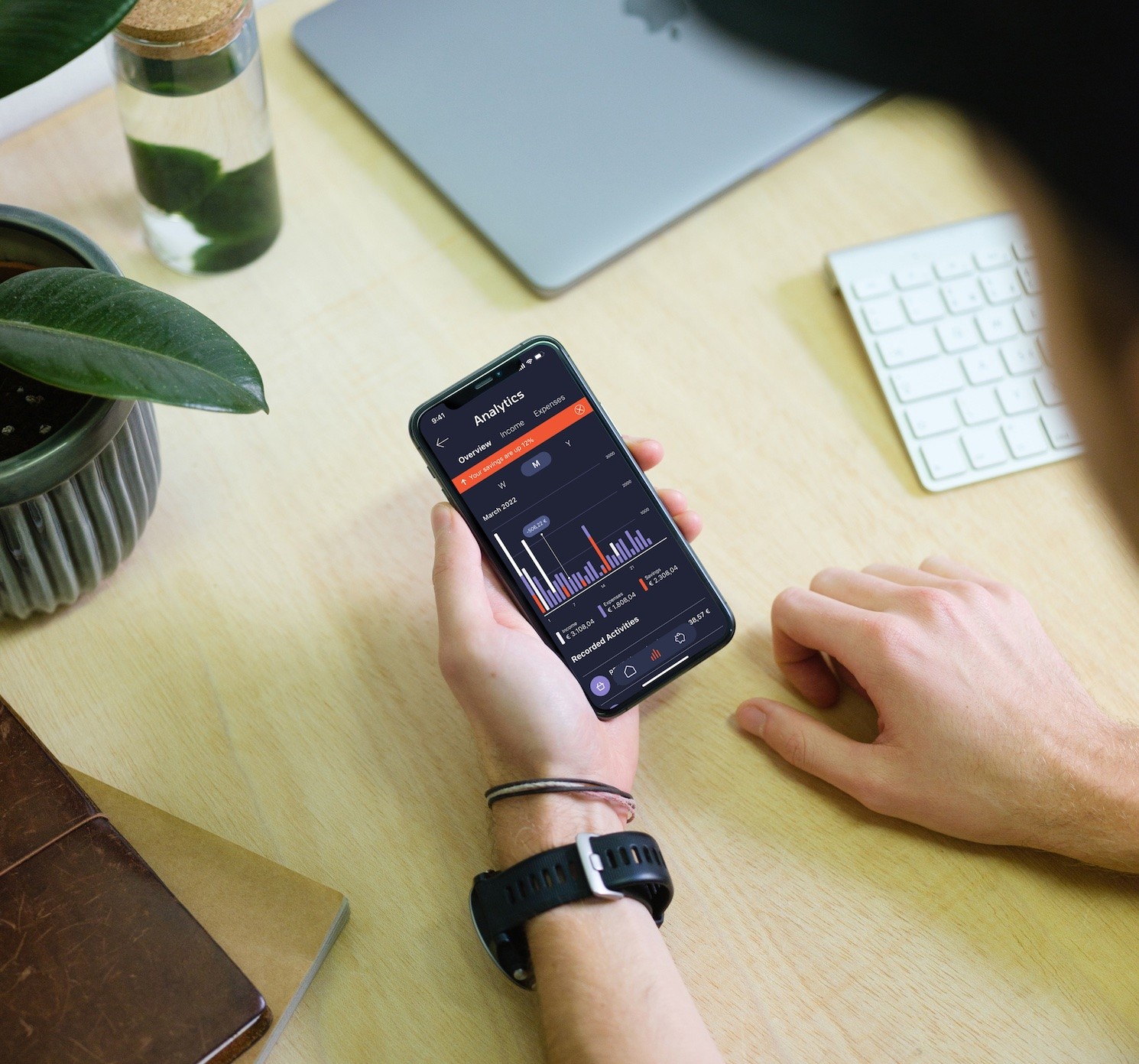
Detailed view of trends and patterns, visual transaction overviews, and savings allocation.
3
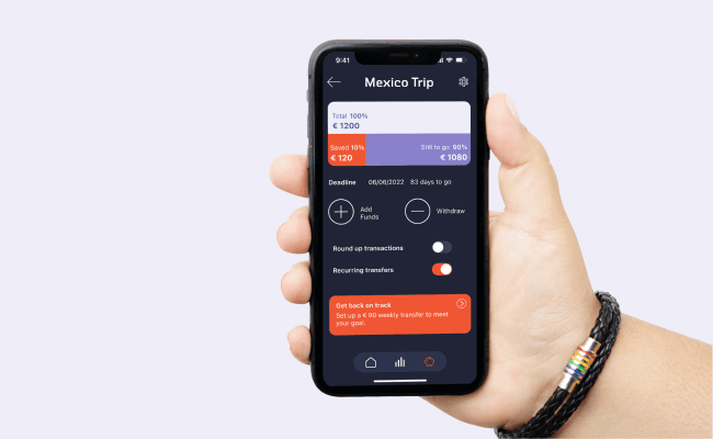
Saving Plans
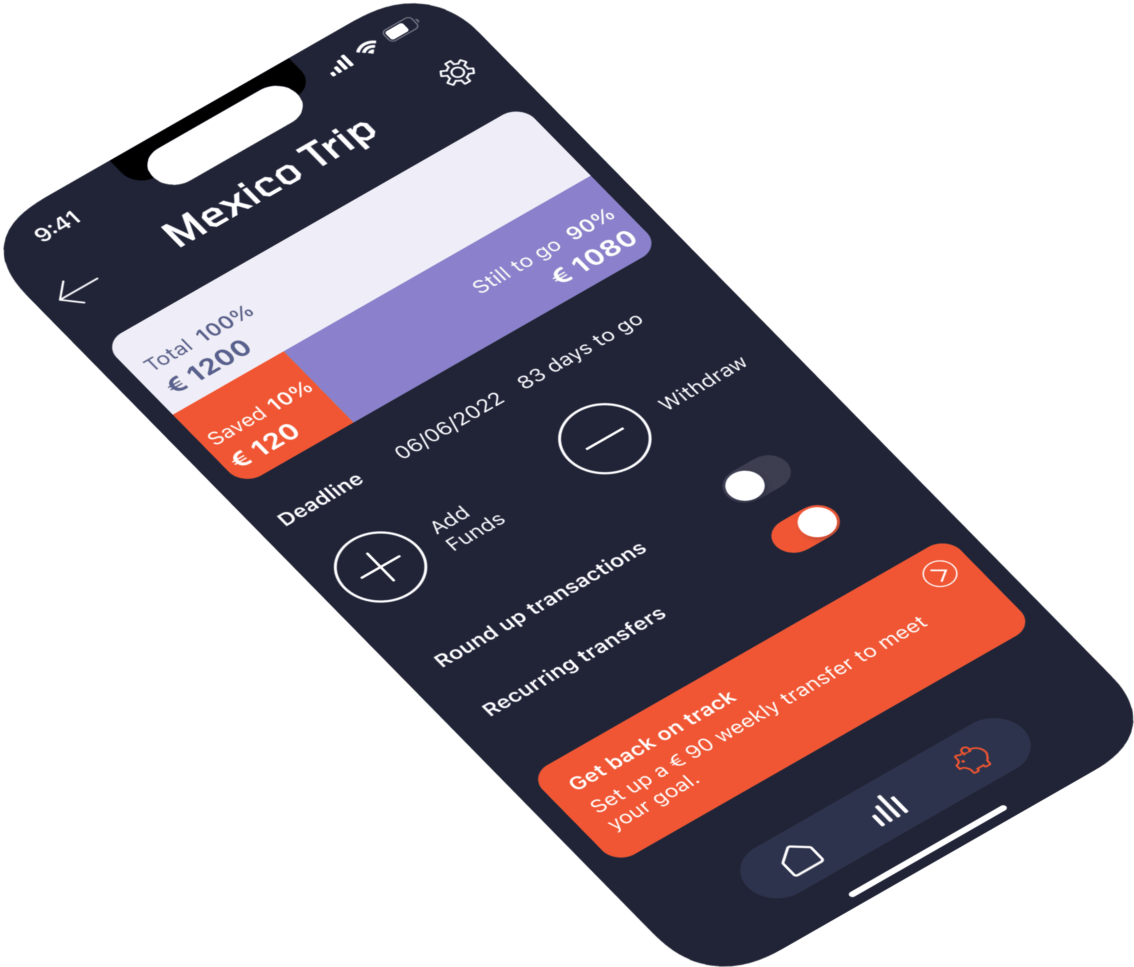
Overview of current goals and status, with a simple, intuitive process for creating new goals.
User Flows
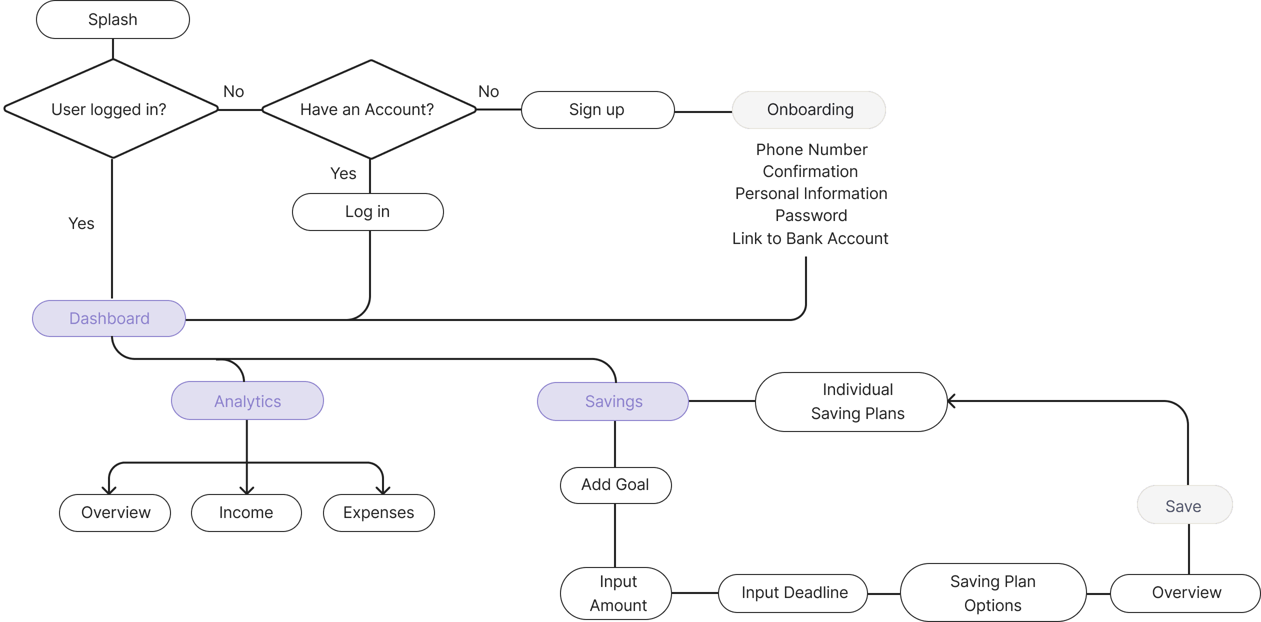
A minimal and intuitive navigation
I focused on creating the most straightforward way for users to create new saving plans and easily access the information they need. Since the app's main focus is on saving plans, the statistics are placed in their own dedicated section, directly from the main navigation.
First Prototype
Wireframing for simplicity
I concentrated on presenting the data in a simple, clear way based on user stories, and designed the flow for creating new saving plans to be supportive without overwhelming the user. Several data visualization and chronological navigation patterns were explored before finalizing the current design.
Branding
Balancing clarity and friendliness
The brand prioritizes simplicity, focusing on trust, precision, and friendliness. The three app categories (Income, Expenses, and Savings) are color-coded, with Savings as the accent color.
CHECK GUIDELINES →
Usability Testing
Simplifying the savings plan setup for new users
To test the main feature I explored how new users approach setting up a Savings Plan within the app. The goal was to evaluate the ease of use and clarity of the process, focusing on users' understanding of key features.
Scenario
You're a new user, and you would like to set up a new Savings Plan. How would you do it?
“It looks ver nice, I like this first visualization. The make it pop and easy to read the information.”
“It seems very colorful to me. But I guess it helps to express different things”
“I like that there are only 3 icons in the bottom and that is floating, makes me feel that is not one of those overhealming apps.”
“I like the overview in Analytics. I get it right away. i wish I could click and explore more.”
"Looks like a lot, but it’s not really too complicated. It takes some seconds to know what is going on but eventually feels super useful”
About the Saving Plan screen: ”It seems that there is something off in this screen, I understand everything, but not as fast as in the other screens”
Final Design
Balancing clarity and friendliness
Onboarding
A step-by-step process designed to build trust while guiding users through inputting sensitive information. The tone and design balance trustworthiness with a friendly approach.
Dashboard
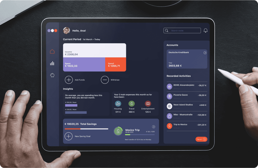
The main landing screen highlights key information at a glance. Users can view their current period's balance, bank account details, and insights based on transactions and goals.
Analytics
Provides detailed, visually organized information with chronological listings and navigation options for full or category-specific overviews.
Savings
As the core feature, this section presents an overview of all saving plans with a clear structure focused on progress.
Responsive and Adaptable
The modular UI design ensures easy adaptation to various screen sizes. Larger screens offer new layout options and expanded possibilities for the dashboard.
Retrospective
Balancing clarity and friendliness
Working with partial guidelines and interpreting a brief was a valuable exercise in balancing client needs with user requirements while maintaining cohesive branding. Despite the abundance of financial tools, this project successfully focused on simplicity and ease of use for effective financial management.
The limited timeframe allowed me to streamline the essentials, though further exploration of data visualisations and additional testing would enhance the product. I look forward to delving deeper into this field.
